But what do I do then with all these bright, bold colors I have in my cardstock stash??
I suck it up, put my big girl panties on and get busy creating! :D

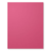
The bright pink in this card is soooooo not my style and I really had to push myself to finish it and not run away crying! Lol! Once I was done, thanks to some Pinterest inspiration, I felt pretty proud of myself! But it still seemed to be missing something...
Yup, that's better! I grabbed my fine-tip marker and added some faux stitching to finish the look!

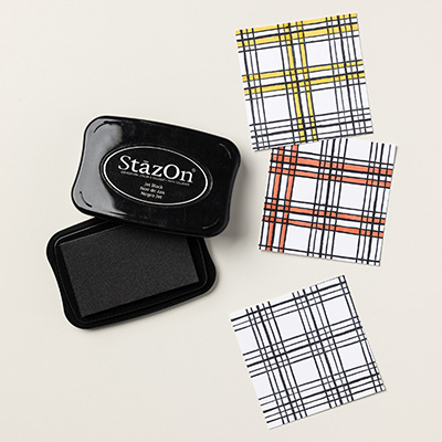
The sentiment was a wee bit disappointing. When stamping onto vellum, it can be a bit tricky. I used my Jet Black StazOn ink so that it would not smear off, but you have to be careful not to press to hard or your stamp will slide and you get a smudged image. So the next time I try stamping on vellum, I think I will use a stamp that is not quite so solid so I get a cleaner look.
I would love to hear from you! What colors do you gravitate towards? Are you a scaredy cat like me or do you embrace the bright and bold?
~ Cayla ~
There are only 13 days left in Sale-A-Bration! For every $60 of product you order, you can choose any item from the Sale-A-Bration catalogs for FREE! Click on the links below or off to the side of this post to check out the free items you could receive! :D
Sale-A-Bration I (last three items in this catalog were a limited time deal until February. Click next link for the new three items available)
Sale-A-Bration II

Sale-A-Bration I (last three items in this catalog were a limited time deal until February. Click next link for the new three items available)
Sale-A-Bration II